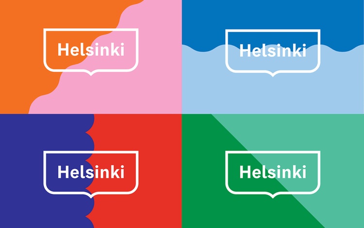
New Logo & Graphic Identity for Helsinki
The Helsinki logo is a simple yet effective logo that uses a combination of geometric shapes and typography to create a sense of modernity and energy. The logo features a blue circle with a white wave inside, which represents the city's location on the coast of the Gulf of Finland. The word "Helsinki" is written in a bold sans-serif font, which adds to the logo's sense of strength and vitality.
The Helsinki logo was created by the design firm Werklig in 2021. The firm was tasked with creating a logo that would be both visually appealing and reflective of the city's values. The logo was well-received by the public and has been used in a variety of marketing and promotional materials for the city.
Here are some of the reasons why the Helsinki logo is so effective:
It is simple and easy to remember.
It is visually appealing and uses a modern color scheme.
It reflects the city's values of modernity, energy, and vitality.
It is versatile and can be used in a variety of contexts.
The Helsinki logo is a great example of how a simple logo can be effective in communicating a city's identity and values.
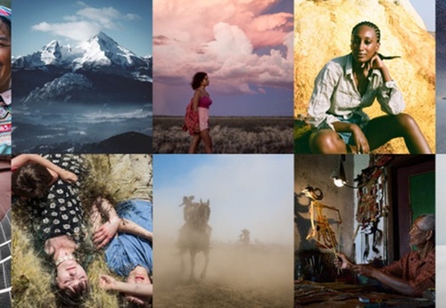
latamarte
Latest
Gallery
Article
- June 09, 2026
The Evolution of Contemporary Latin American Photography
Article
- June 09, 2026
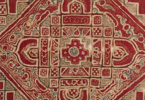
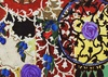
Sacred Geometry in Mayan Textile Art
Publications
- June 09, 2026
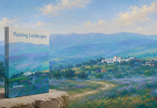
Painting Landscapes by Kevin Scully

Daily Artwork
- June 09, 2026
Child in war
Daily Artwork
- June 09, 2026
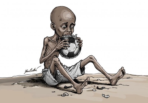
World Cup of Hunger

Gallery
- June 08, 2026
Gallery Of Illustration By Elisa Galvan - Mexico
Gallery
- June 08, 2026
Gallery of Photography by César Rodríguez – Mexico
Publications

- June 09, 2026
The Evolution of Contemporary Latin Ame…

- June 09, 2026
Sacred Geometry in Mayan Textile Art
- June 06, 2026
Antonio Berni: The Epic of Juanito Lagu…

- June 06, 2026
Magical Realism in the Paintings of Til…
- June 03, 2026
The Clay Architecture of Eladio Dieste

- June 02, 2026
Graciela Iturbide’s Photography and the…
- June 02, 2026
Guillermo Kuitca: The Map as a Psycholo…
- May 31, 2026
Art and Resistance: The Role of Visual …

- May 26, 2026
Hélio Oiticica and the Aesthetics of th…
- May 26, 2026
The Art of Ceramics in the Chancay Cult…
- May 25, 2026
Doris Salcedo: Silence as a Cry of Resi…
- May 24, 2026
The Art of Sculpture in Latin America: …
- May 23, 2026
The Cinematography of Light in the Work…

- May 21, 2026
Fernando Botero: Volume as Aesthetic Ex…

- May 20, 2026
Remedios Varo: Alchemical Surrealism in…
- May 20, 2026
Spatialism and Light in the Work of Luc…

- May 19, 2026
Frida Kahlo: The Aesthetics of Pain and…

- May 19, 2026
Tarsila do Amaral's Anthropophagy and B…

- May 18, 2026
The Healing Power of Art in Times of Cr…

- May 17, 2026
When Art Speaks Louder Than Weapons
- August 29, 2023
The history of Bolivian art
- February 19, 2024
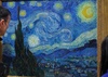
Analysis and meaning of Van Gogh's Star…
- January 28, 2024
Culture and Art in Argentina

- September 25, 2023
What is the importance of art in human …
- September 23, 2023
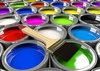
What is paint?

- August 23, 2023
The 11 types of art and their meanings
- August 10, 2023
14 questions and answers about the art …

- September 23, 2023
Painting characteristics
- August 30, 2023
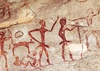
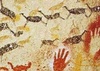
First artistic manifestations
- January 12, 2024
10 most beautiful statues and sculpture…

- March 26, 2024
The importance of technology in art1
- September 23, 2023
History of painting
- October 18, 2023
History of sculpture

- March 26, 2024
Cultural identity and its impact on art…

- July 13, 2024
The impact of artificial intelligence o…

- December 20, 2024
What is art? Definition, concept and ar…
- April 07, 2024
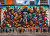
Graffiti in Latin American culture
- November 06, 2023
5 Latin American artists and their works
- August 16, 2023
The 15 greatest painters in art history

- April 02, 2024
History visual arts in Brazil
- February 19, 2024
Analysis and meaning of Van Gogh's Star…

- August 13, 2023
9 Latino painters and their great contr…
- August 23, 2023
The 11 types of art and their meanings

- August 27, 2023
15 main works of Van Gogh
- August 10, 2023
14 questions and answers about the art …
- August 29, 2023
The history of Bolivian art
- January 28, 2024
Culture and Art in Argentina
- November 06, 2023
5 Latin American artists and their works
- September 23, 2023
Painting characteristics
- September 23, 2023
What is paint?
- September 25, 2023
What is the importance of art in human …
- March 26, 2024
Cultural identity and its impact on art…
- August 30, 2023
First artistic manifestations

- December 18, 2023
10 iconic works by Oscar Niemeyer, geni…
- January 12, 2024
10 most beautiful statues and sculpture…

- August 24, 2023
The most famous image of Ernesto "Che" …

- January 20, 2024
What is the relationship between art an…

- October 30, 2023
Characteristics of Contemporary Art

- May 26, 2024
Técnicas de artes visuais

- August 22, 2023
What are Plastic Arts?