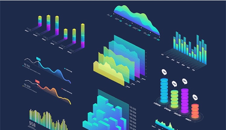
Interactive Charts: A New Visual Experience
In today's digital age, interactive charts have become an essential tool for communicating data in a clear, engaging, and dynamic way. Unlike static charts, interactive charts allow users to explore, modify, and customize the information presented, improving understanding and engagement with the content.
From media to corporate reports, the use of interactive charts has expanded rapidly. Platforms such as Tableau, Power BI, and D3.js allow the creation of impactful visualizations that respond to user input: when hovering, clicking, or filtering data, the charts adapt in real time.
This technology not only enhances reports but also offers a richer educational experience. In academia, for example, complex statistics can be presented in a way that allows students to interact directly with the data, thus encouraging more active learning.
In short, interactive charts are not just a fad, but a powerful tool that transforms the way we visualize and understand information.
Latamarte
Latest

Publications
- February 12, 2026
WAR AGAINST WAR | Photography and World War One
Article
- February 12, 2026
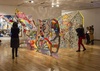
Contemporary Printmaking and the Concept of Expanded Field

Article
- February 12, 2026
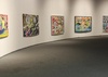
Graphic design as visual language in contemporary culture
Gallery
- February 12, 2026
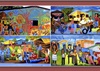
Gallery of Cartoons by Gilmar-Brazil 3
Publications
- February 12, 2026
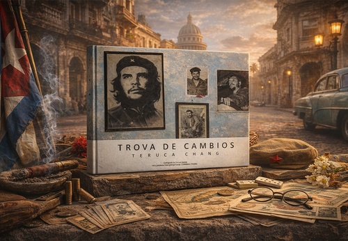
TROVA DE CAMBIOS | Photographs by Teruca Chang (Chile)

Gallery
- February 11, 2026
Colorful Cuba: Life Through the Lens of Jim Zuckerman (USA)
Gallery
- February 11, 2026
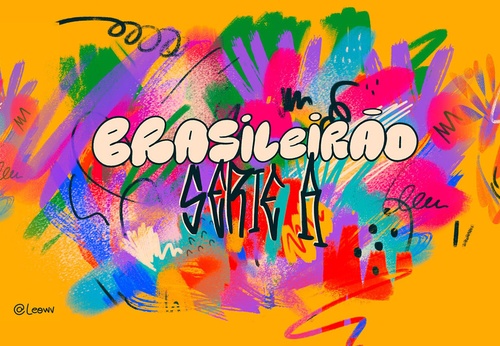
Brasileirão | Football Illustrations by Léo Vargas (Brazil)
Gallery
- February 10, 2026
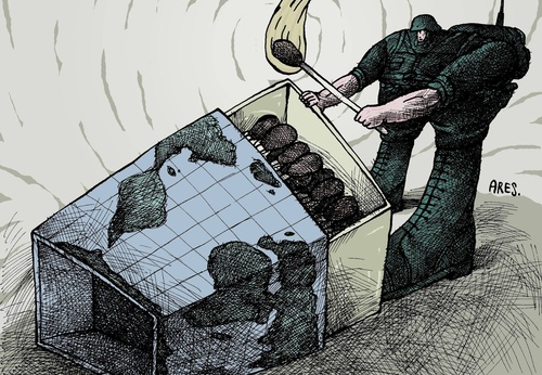
Gallery of Cartoons by Ares-Cuba
News
- February 10, 2026
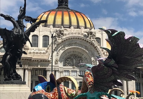
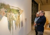
Latin American Art Cultural Encounter for the France-Mexico Bicentennial

- February 12, 2026
Contemporary Printmaking and the Concep…

- February 12, 2026
Graphic design as visual language in co…
- February 10, 2026
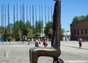
The Forging of Modern Mexican Sculpture

- February 10, 2026
The Legacy of the Avant-Garde in Modern…

- February 09, 2026
Fernando Traverso: The Art of Absence a…

- February 09, 2026
Latin American Art and the Palestinian …

- February 08, 2026
Indigenous Artistic Expressions of Lati…
- February 08, 2026
Indigenous Artistic Expressions of Lati…
- February 07, 2026
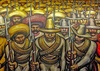
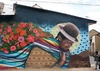
Muralism in Latin America: The Pictoria…
- February 07, 2026
Painting in Latin America: A Journey of…

- February 03, 2026
Artificial Intelligence and the Reconfi…
- February 02, 2026
10 most expensive Latin American painti…

- February 02, 2026
Importance of visual arts at School

- February 01, 2026
Impressionism and the Revolution of Lig…

- February 01, 2026
The Importance of Urban Art in the Iden…

- January 31, 2026
Artificial Intelligence in Graffiti Art

- January 31, 2026
The Future of Street Art

- January 28, 2026
Globalization and New Discourses in Con…

- January 28, 2026
Contemporary Art in Latin America

- January 27, 2026
The Evolution of Art: From Classical to…
- August 29, 2023
The history of Bolivian art

- February 19, 2024
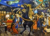
Analysis and meaning of Van Gogh's Star…
- January 28, 2024
Culture and Art in Argentina

- September 25, 2023
What is the importance of art in human …

- September 23, 2023
What is paint?

- August 23, 2023
The 11 types of art and their meanings

- August 10, 2023
14 questions and answers about the art …

- September 23, 2023
Painting characteristics

- August 30, 2023
First artistic manifestations

- January 12, 2024
10 most beautiful statues and sculpture…

- September 23, 2023
History of painting

- March 26, 2024
The importance of technology in art1

- July 13, 2024
The impact of artificial intelligence o…
- October 18, 2023
History of sculpture
- March 26, 2024
Cultural identity and its impact on art…

- December 20, 2024
What is art? Definition, concept and ar…

- April 07, 2024
Graffiti in Latin American culture
- August 16, 2023
The 15 greatest painters in art history

- April 06, 2024
History of visual arts in Ecuador

- April 02, 2024
History visual arts in Brazil
- February 19, 2024
Analysis and meaning of Van Gogh's Star…

- August 13, 2023
9 Latino painters and their great contr…
- August 23, 2023
The 11 types of art and their meanings

- August 27, 2023
15 main works of Van Gogh
- August 10, 2023
14 questions and answers about the art …
- August 29, 2023
The history of Bolivian art
- January 28, 2024
Culture and Art in Argentina

- November 06, 2023
5 Latin American artists and their works
- September 23, 2023
Painting characteristics
- September 23, 2023
What is paint?
- September 25, 2023
What is the importance of art in human …
- March 26, 2024
Cultural identity and its impact on art…
- August 30, 2023
First artistic manifestations

- December 18, 2023
10 iconic works by Oscar Niemeyer, geni…

- January 20, 2024
What is the relationship between art an…
- January 12, 2024
10 most beautiful statues and sculpture…

- August 24, 2023
The most famous image of Ernesto "Che" …

- October 30, 2023
Characteristics of Contemporary Art

- August 22, 2023
What are Plastic Arts?

- May 26, 2024
Técnicas de artes visuais