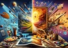
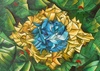
10 Golden Rules of Typography
1️⃣ Choose the right font
Every text has a voice—pick the one that speaks your message best.
2️⃣ Start with one typeface, not an army!
Simplicity is beauty; too many fonts only tire the reader’s eyes.
3️⃣ Respect the size
Titles should breathe; text should be readable. Feel the balance between big and small.
4️⃣ Give space its due
Spacing between lines and letters is the breath of your text—don’t suffocate it.
5️⃣ Keep alignment in mind
Visual order guides the eye; let your lines be friends, not strangers.
6️⃣ Mind your kerning
Letters love proper spacing—neither too close nor too far, just the right affection.
7️⃣ Create contrast, but gracefully
Bold vs. thin, big vs. small, dark vs. light—play with contrast, but stay polite.
8️⃣ Balance your lines and shapes
The human eye loves harmony; don’t let your text lean to one side.
9️⃣ Readability beats beauty
If it can’t be read easily, even the most beautiful design fails.
🔟 Stay calm
Typography is the art of breathing—let your words live, breathe, and be seen.
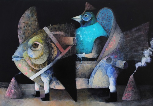
Latamarte

Massoud Najabati
By LatAm ARTE
Massoud Nejabati was born in 1967 in Tehran. He completed his bachelor's and master's degrees in graphics from the Faculty of Fin ...
Latest

Publications
- January 27, 2026
Aztecs in the Empire City: “The People Without History” in The Met

News

Article
- January 27, 2026
The Evolution of Art: From Classical to Digital

Article
- January 27, 2026
What are Visual Arts and Why Do They Matter Today?

Gallery
- January 27, 2026
Selected Illustration Gallery of Venezuelan Artists

Gallery
- January 27, 2026
Selected Caricature Gallery of Cuban Artists
Publications
- January 26, 2026
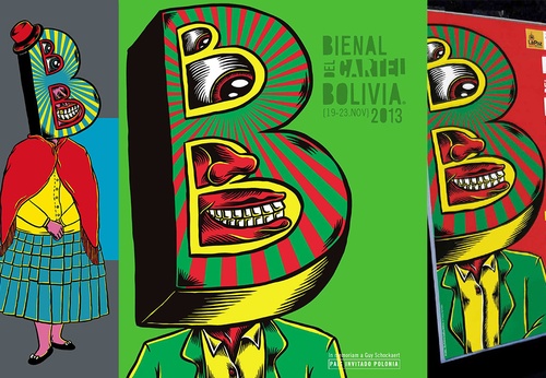
Bolivia Poster Biennial (BICeBé 2013)
Gallery
- January 26, 2026
Selected Gallery of Paintings by Peruvian Artists

Gallery
- January 26, 2026
Selected Gallery of Watercolor Paintings by Peruvian Artists

- January 27, 2026
The Evolution of Art: From Classical to…
- January 27, 2026
What are Visual Arts and Why Do They Ma…

- January 26, 2026
First artistic manifestations
- January 26, 2026
Art in the Street: Expression, Identity…

- January 25, 2026
text-to-image generator with ai

- January 25, 2026
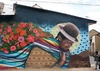
The 'uncomfortable' muralist who portra…

- January 24, 2026
Artificial Intelligence as a Tool and C…

- January 24, 2026
Artificial Intelligence in Art
- January 21, 2026
Art of Artificial Intelligence and its …
- January 21, 2026
5 most striking features of modernism

- January 19, 2026
History of painting
- January 19, 2026
Conditions and characteristics of sacre…

- January 08, 2026
The art of caricature in Latin America
- January 07, 2026
Languages, Aesthetics, and Meaning of C…
- January 07, 2026
Street Art as a Form of Social and Cult…
- January 06, 2026
Symbolism and Spirituality in Latin Ame…
- January 06, 2026
Sacred Art in Latin America: Meeting be…

- January 05, 2026
The Importance of Art in Society
- January 04, 2026
Graphic Art: Much More Than an Image, a…
- January 04, 2026
The Future of NFTs and AI-Generated Art
- August 29, 2023
The history of Bolivian art
- February 19, 2024
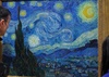
Analysis and meaning of Van Gogh's Star…
- January 28, 2024
Culture and Art in Argentina

- September 25, 2023
What is the importance of art in human …
- September 23, 2023
What is paint?

- August 23, 2023
The 11 types of art and their meanings
- August 10, 2023
14 questions and answers about the art …

- September 23, 2023
Painting characteristics
- August 30, 2023
First artistic manifestations
- January 12, 2024
10 most beautiful statues and sculpture…
- September 23, 2023
History of painting
- March 26, 2024
The importance of technology in art1
- July 13, 2024
The impact of artificial intelligence o…
- March 26, 2024
Cultural identity and its impact on art…
- April 07, 2024
Graffiti in Latin American culture
- April 02, 2024
History visual arts in Brazil
- April 06, 2024
History of visual arts in Ecuador
- August 16, 2023
The 15 greatest painters in art history
- October 18, 2023
History of sculpture
- March 05, 2024
The art of sculpture in Latin America
- February 19, 2024
Analysis and meaning of Van Gogh's Star…

- August 13, 2023
9 Latino painters and their great contr…
- August 23, 2023
The 11 types of art and their meanings
- August 10, 2023
14 questions and answers about the art …

- August 27, 2023
15 main works of Van Gogh
- August 29, 2023
The history of Bolivian art
- January 28, 2024
Culture and Art in Argentina

- November 06, 2023
5 Latin American artists and their works
- September 23, 2023
Painting characteristics
- September 23, 2023
What is paint?
- September 25, 2023
What is the importance of art in human …
- March 26, 2024
Cultural identity and its impact on art…
- August 30, 2023
First artistic manifestations

- December 18, 2023
10 iconic works by Oscar Niemeyer, geni…

- January 20, 2024
What is the relationship between art an…
- January 12, 2024
10 most beautiful statues and sculpture…

- August 24, 2023
The most famous image of Ernesto "Che" …

- October 30, 2023
Characteristics of Contemporary Art

- May 26, 2024
Técnicas de artes visuais

- August 22, 2023
What are Plastic Arts?